ANGRY INTRO RANT I’M CURRENTLY TOO LAZY TO WRITE WOULD GO HERE.
Coke (UK)
I count 11 words, nine if we allow ZERO SUGAR. Crossing out words does not make them invisible. Also, they hashtagged it. Who the Hell approved this. From last month. Via Vikki Ross on Twitter.
Vacationauts (Florida Tourism)
A disastrous example of why you should examine your lazy pun headlines VERY CLOSELY before release. It’s a CHALLENGE, I know. But it could save careers, lives even. Ad agency: Paradise, St. Petersburg.
Coopers Beer (Australia) and Stolichnaya (NYC)
Coopers—SCENE: Adelaide bar. MATE #1: “Hey mate, why a Coopers?” MATE #2: “Because it’s the beer that beer would drink mate.” MATE #1: “How do you know that mate?” MATE #2: “Cause I saw it said so at me bus stop mate.” This is the dumbest beer ad I’ve ever seen, which is saying something. Ad agency: kwp! Advertising, Addelaide.
Stoli—(snapped on an UWS phone kiosk [RIP]) I guess that’s better than THE VODKA THAT TASTES LIKE RAT PUKE. However, if you know a bit about vodka, you know that the best “purest” vodkas taste very nearly like nothing. Seems Stoli was trying to dupe novices, and just plain stupid people, here. Shame on them. Ad agency: The Martin Agency. Creative Note: The invisible bottle art direction is appealing.
Dasani
(See above two lazy AF ads) Wat-er you saying Dasani? Does the bottle “say” water when you open it? Does Dasani mean “water” in some obscure langauge (no, it doesn’t)? But hey, they got the word water in there three fucking times. A redditor said, “This is some kind of postmodern masterpiece”. More like a post-intelligence masterpiece. (Note: that’s not me in the reflection.)
Bud and Bud Light (USA)
L—Bud spot sign off from 2017. Your dream, sponsored by Bud. Unofficially and unpaid (to you). If you’re relentlessly on your “dream path”, drink us, liberally, and we’ll help you get there…somehow (no guarantees, no refunds). R—sign off on a Bud Light 2017 commercial. Here, we have the very lazy, hacky, overused “You’re not just doing thing with our product, you’re doing other fucking transcendental thing”.
Look at the guys’ faces. So much Heaviness from a light beer ad.
ADIDAS (Italy)
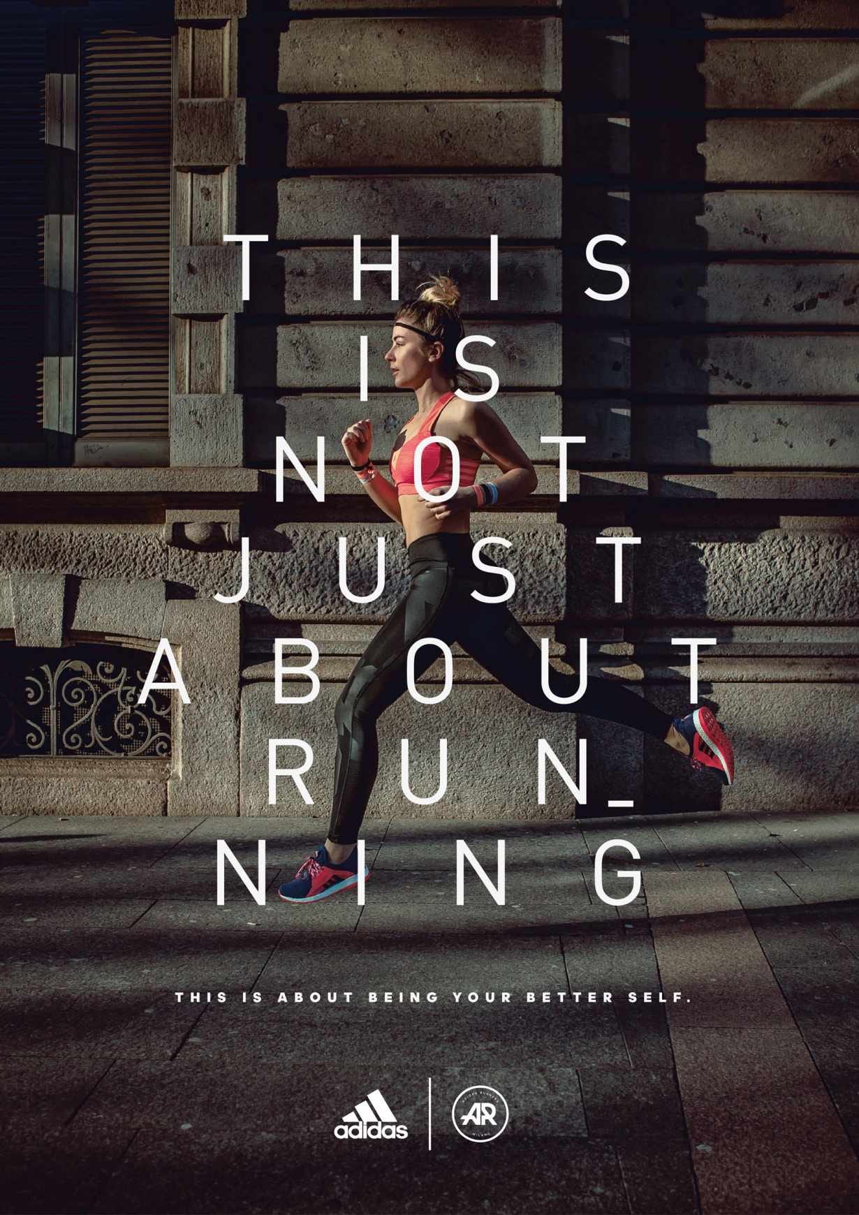
(See above commentary about lazy hacky copy) I was a runner for many years. My parents were both competitive distance runners, ran several marathons. Running is ALWAYS about running, nothing else. Your lungs and your legs SCREAM that at you. After running, well there you can load up bullshit cliches. Ad agency: The Big Now, Milan.
Coors Light (NYC)
(snapped at a Penn Station subway entrance) WE PUT COLD ON THE MAP. Another headline so stupid it makes your brain hurt. What map? WTF is COLD? No, I get it; they’re referencing The Rockies where their beer was supposedly “born” (but no longer comes from). Any beer in a fridge or freezer is exactly as COLD as Coors Light. Put the can on an A train platform in July and it’ll very quickly be hotter than Flamingo piss. L—Just shut the fuck up.
Heineken Light (NYC)
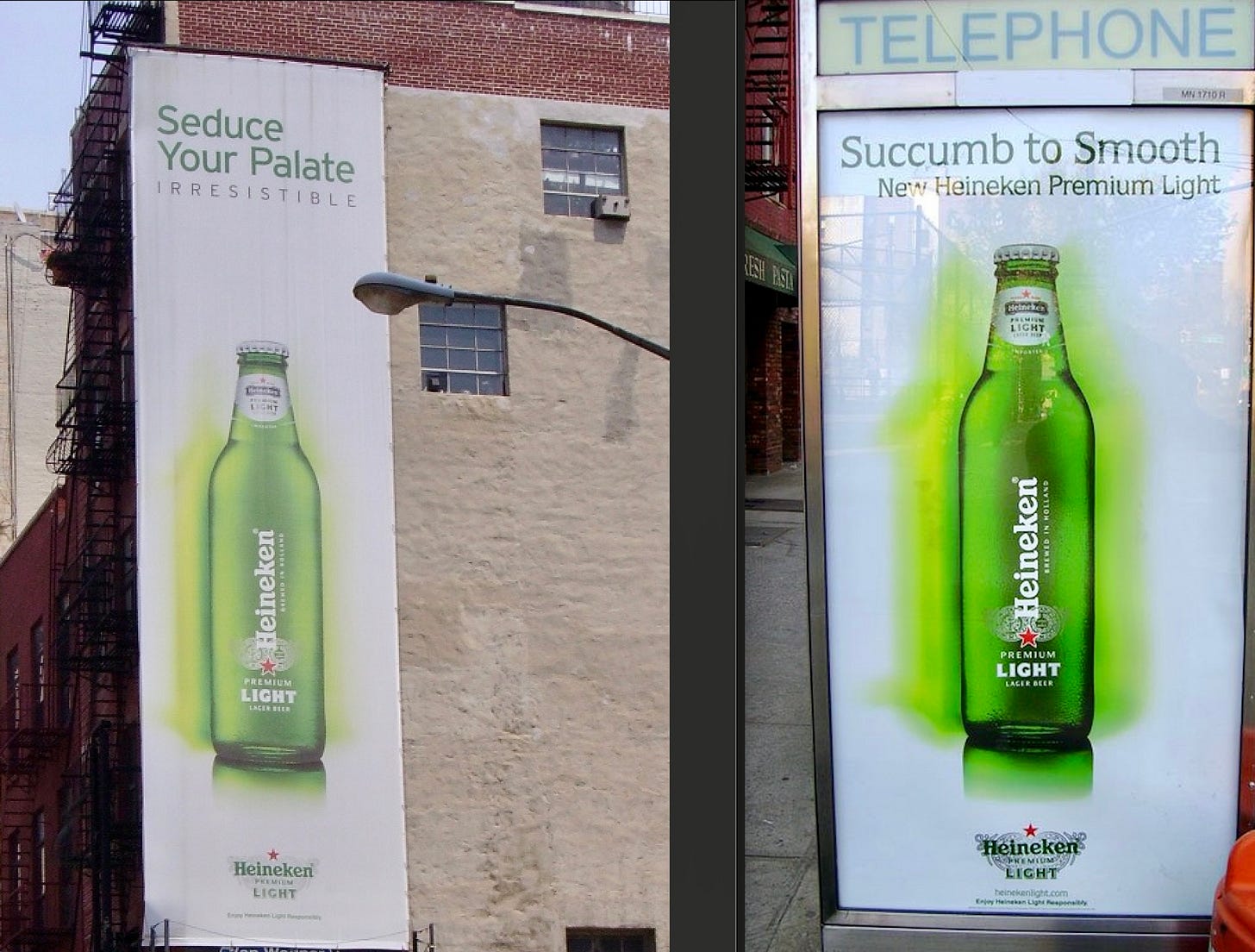
(Street ads snapped by me 15 years ago) The third ad in the campaign was “Temptation Has A Taste”. Here we have an extremely lazy attempt to use “sex” to sell an unsexy product. Seduce? Succumb? Add phalic, back-lit product shots and I’m sure NYC women (the target here) couldn’t help rubbing one out right there in public. You’re “engorged” right now, aren’t ya?
Legal & General (UK)
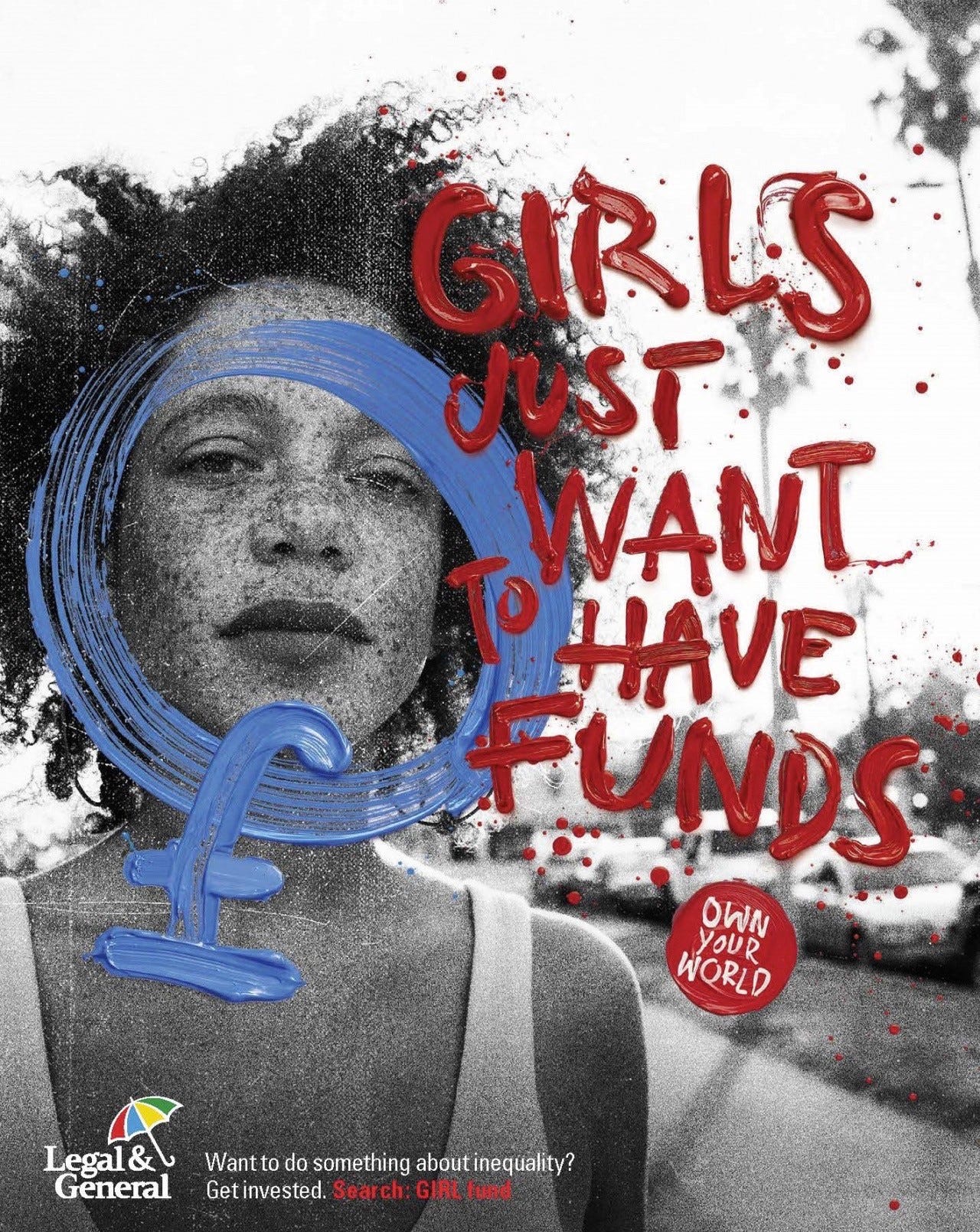
IN 2019, Legal & General, a 180-year-old UK-based financial services company, launched an investment product called GIRL Fund “which empowers all of us to use our money to help improve gender diversity in the UK.” Good cause. But an awful, lazy, demeaning pun of a headline. And the childish finger paint font makes it even more insulting to girls, women, all humans.
What probably happened here was the copywriter came up with the line after about 30 seconds of thought — ‘hey, it’s got the words GIRL and FUNDS in it!’ The over-extended creative director, recognizing something the unsavvy client would buy INSTANTLY, approved it and stopped all other work on the account. Agency: M&C Saatchi, London.
High Noon Hard Seltzer (USA)
May I? Gee thank you very fucking much, High Noon. I’ve considered it, and it is the worst beach read I’ve ever read. From this May. Ad agency: Preacher, Austin, TX.
Häagen-Dazs
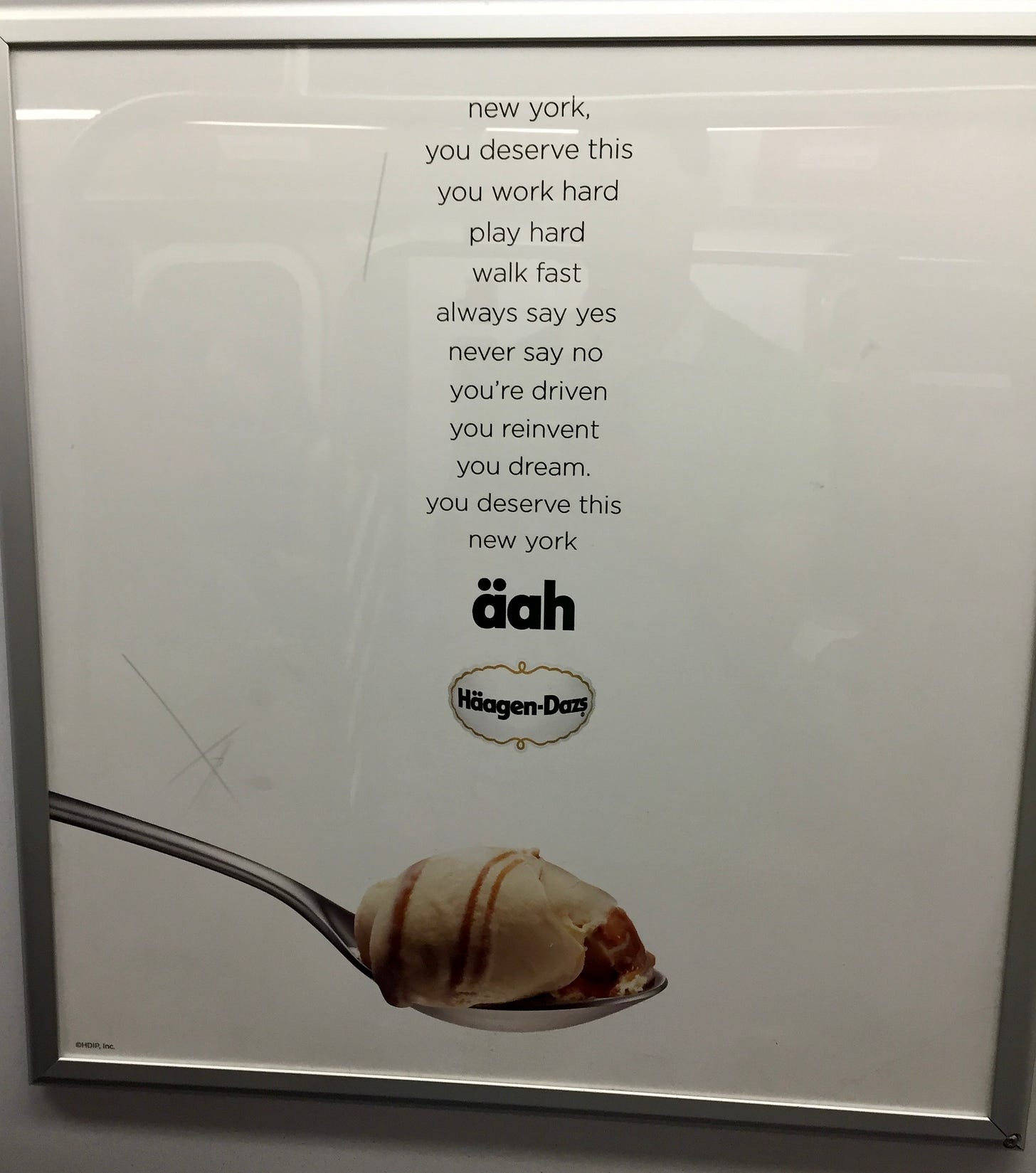
(snapped on an A Train) Brands are always trying to show they are “down” with New Yorkers by placing “targeted” ads in subway stations and trains. And 90% of them just embarrass themselves.
I wish I could have taken a shit on this platitudinal, condescending subway poster. But it’s on the wall and behind special graffiti (and shit)-proof glass.


I can't imagine it's ever good to go with "There's nothing quite like this" as your selling point, but considering that Dasani is widely loathed for its taste and essentially being bottled tap water, I'm surprised they also would risk putting "water" in quotes.
I keep waiting for the end of platitudinal advertising, but then I see these other alternatives and feel like it's never going away. High Noon is the worst. It's advertising ... their billboard? ... and is also basically a curse.
These are terrible except the florida one. What am i missing? why is that one so bad?