White Supremacist Flyers: A Professional Creative Review
This is, strictly, a review of concepts, copywriting, and art direction. THIS IS NOT A POLITICAL ARTICLE.
In the last, oh, 7 years or so, America has seen a large increase in white supremacist propaganda in its driveways, on its college campuses, on its telephone poles, and on its municipal buildings. It appears none of the organizations have used ad agencies though some of the flyers are nicely designed. I graded them B—D. (I don’t believe in “Fs” if you complete the assignment. Nobody earned an “A”.)
(NOTE: I didn’t research any of these groups.)
Patriot Front
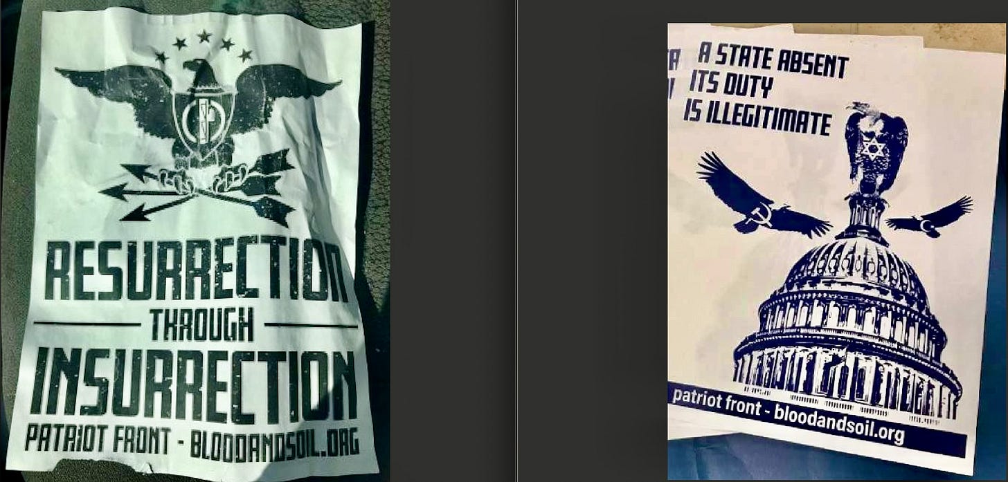
L—Plus: Not just rhyming wordplay, double “surrection” verbiage. Negative: Overused Nazi symbolism image. OK layout. Grade-C+
R—Here we have at least an attempt at a concept. You got yourself three vultures: Communist, Muslim, and at the top of the Capitol, a Jewish one. “Absent Its Duty” is a pretty ominous if nebulous phrase, but one can make a thought-jump guess as to what they’re saying. Grade-B.
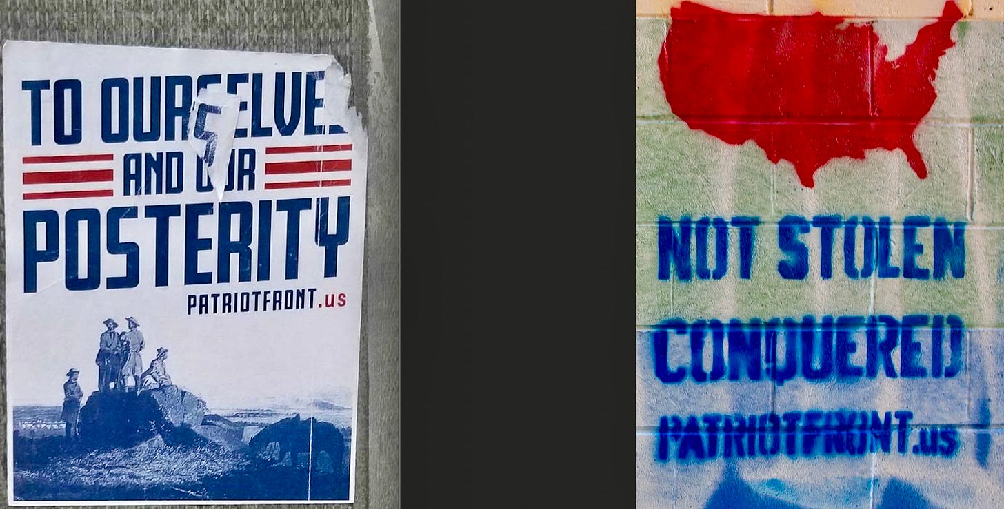
L—Spotted right here in the Great Melting Pot of NYC. The art is a vintage image of American frontiersmen, or something (there’s a horse). The headline is, what we call in the ad biz, a chest-thumper—saluting themselves and all their future selves. They’ve dialed back the anti-everybody-else messaging for my liberal town. It’s not “disruptive” enough. Grade-C.
R—Ooh, stencil art. Gotta give them props for consistency of typeface. Nice Republican-baiting image of an all RED ‘merica. Copy is of course a purposeful gut-punch to American Indians. It’s certainly provocative. Grade-B.
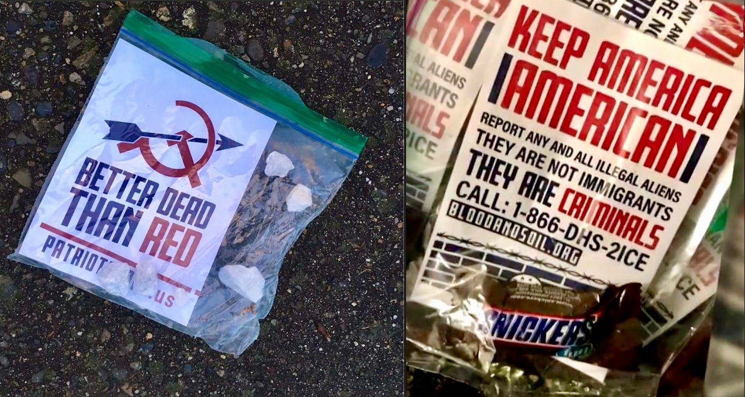
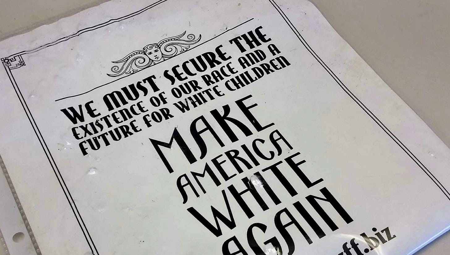
Lastly, Driveway BaggieVertising!
L—One of my high school history teachers (an arrogant asshole in a leisure suit) gave us a “Would you rather be Dead or Red” essay assignment (this was…many years ago). I chose Red. I don’t remember what I wrote, something about faking it to stay alive. Above is of course not an original copy line but it is an interesting choice, considering how many “alt-right” leaders are embracing Putin and even Communism over Biden. Those are not “crack” rocks weighing down the baggie. They are all white, though—nice subtle branding. Grade—C+.
R—Now that’s smart: putting a Snickers (others had Kit Kats) in the baggie. No ambiguous bullshit words here, they get straight to the “reason to buy” with a real call-to-action. Grade—B.
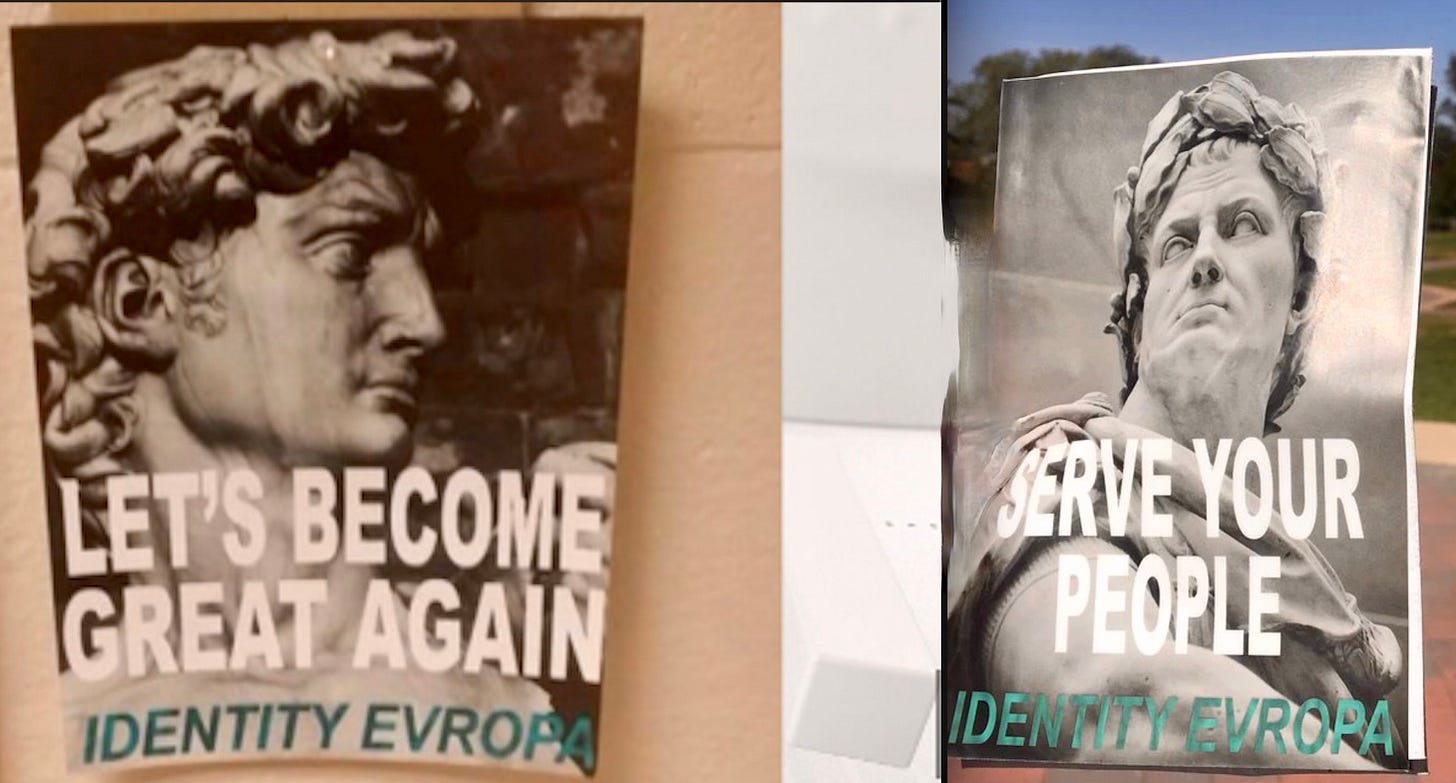
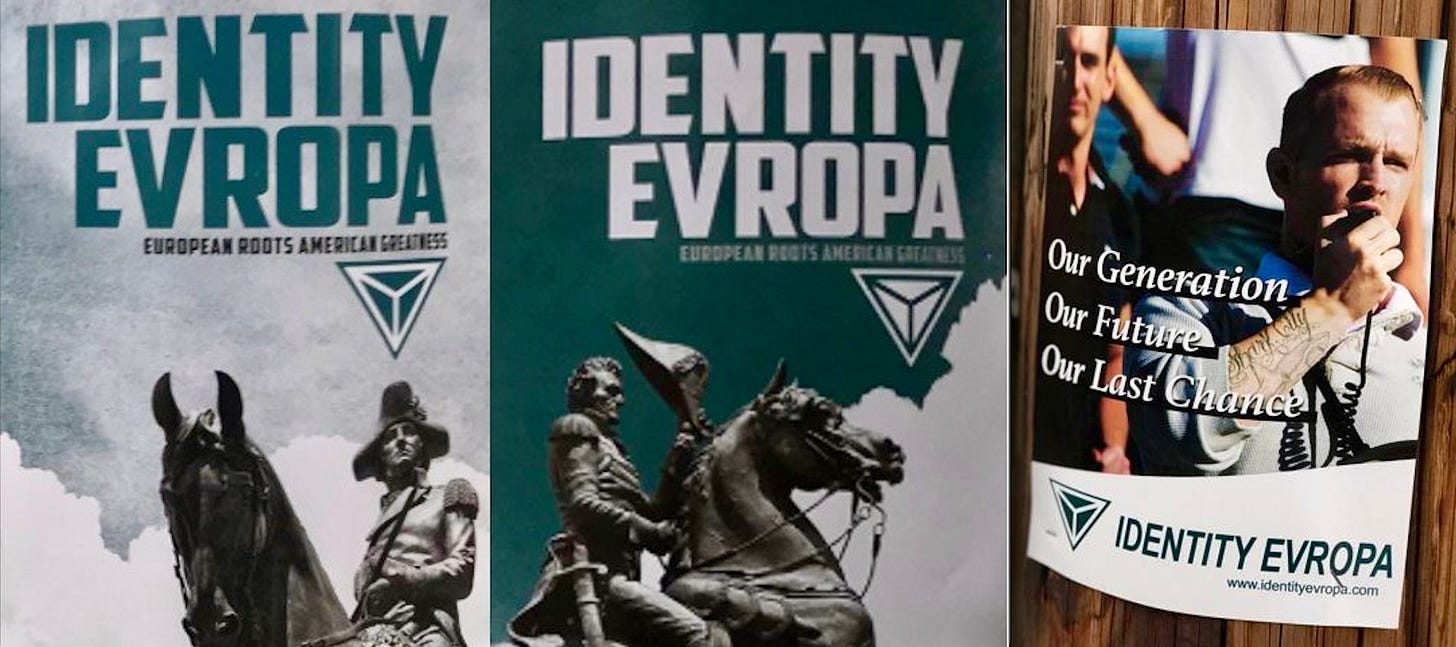
Identity Evropa
L—An obvious tribute to Trump and his supporters. Kind of a clunky line. They at least make an attempt at a consistent campaign look as many of their posters feature (stock) shots of old Roman (and such) leaders’ statues. Grade-C.
R—“YOUR PEOPLE” are white Americans of non-Jewish European descent (I already knew this about them.). Headline is a bit boring. Grade—C.
L—Two posters seemingly featuring Napoleon statues. This is the closest I can find (believe me, I looked) to a tagline: European Roots American Greatness, not a bad line. Grade-C+.
R—OK, now we got some hackles-(or pride-)raising copy. “Our Last Chance”—that’ll scare the Libs. I don’t know who the guy with the mic is, I guess he’s recognizable to the target audience. White type, even outlined, is always hard to read (unless on black). Grade: B-.
Daily Stormer
L—This poster put Queen’s “White Man” in my head. No punches pulled with that copy or symbolism. The justified text gives the poster a clean look. Grade-B-.
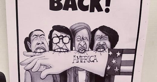
R—This flyer was posted near/on synagogues across the country, apparently—I’m guessing—trying to get conservative Jewish people on-board for the race war (hoping they hadn’t seen the left poster, I guess). The caricatures are Congressional women of color. Is that Uncle Sam’s hand they’re chewing on? They should have a hired a pro illustrator because this artwork is a mess. Grade-D.
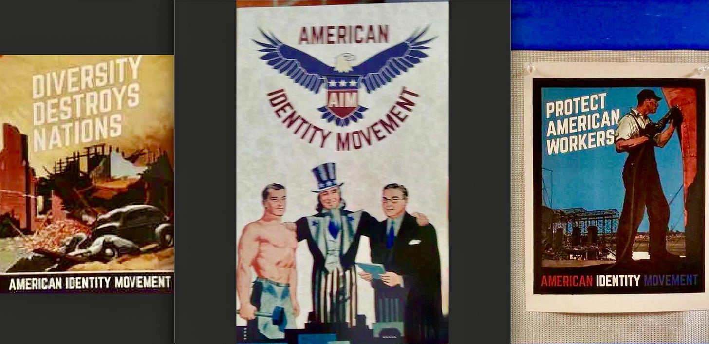
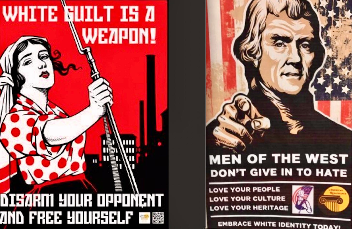
American Identity Movement (previously Identity Evropa)
The left poster is the only one worth discussing here. The middle one is kind of goofy-looking. Somewhat ironically, the right and left posters use vintage Soviet-style illustrations. The left headline is the only thing that stands out here. Grades, L-R: B, D, C.
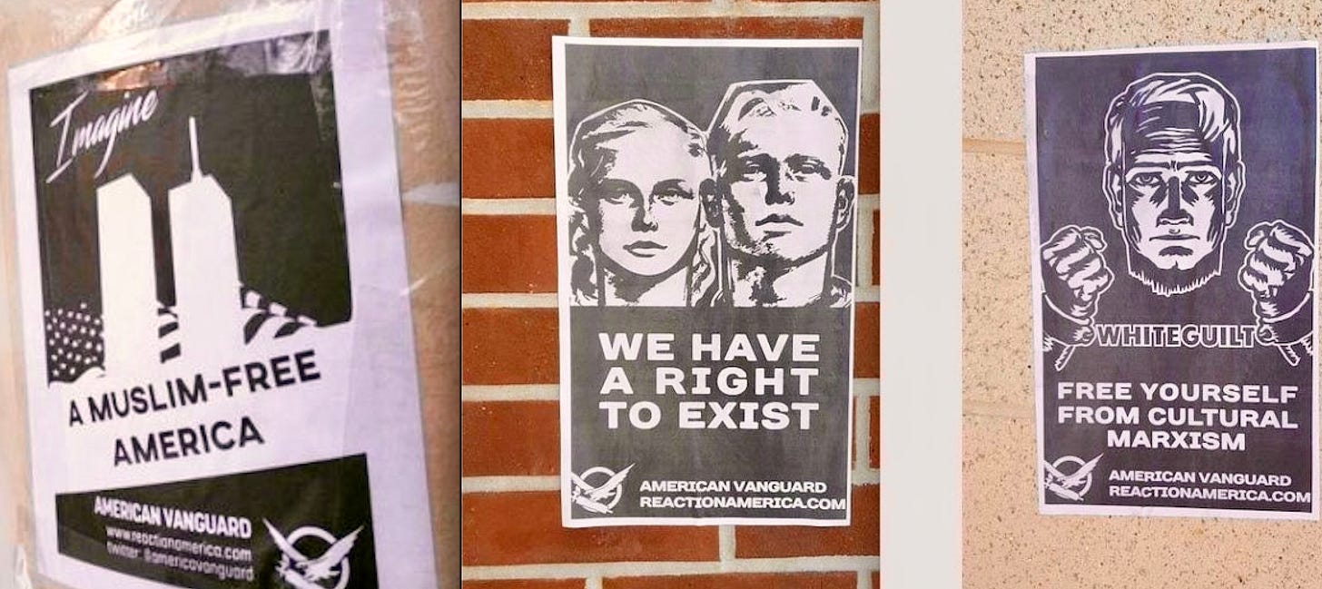
American Vanguard
L—I’m surprised I only found one poster that uses the Twin Towers to engage/enrage. At least three different typefaces=too busy design. “Imagine” how much better this leaflet would look if you hired a pro designer. Grade-D.
M—Nothing to add. R—Ooh, type as a chain. Somebody had a pretty good visual idea here, but I don’t know how to free myself from “cultural Marxism”. Grade-B-.
The Right Stuff
That typeface is bugging the shit out of me. (Sorry, I’m a typeface elitist.) MAKE AMERICA WHITE AGAIN—I think that line was on somebody’s else’s notepad (OK, Word doc) first. Grade-C-.
The Base
The Base, I learned not on purpose, is more active with “self-defense” training. Which I guess is why they have a Nazi soldier skeleton visual. (That helmet is a WWII German helmet, I am an amateur WWII expert.). At least there’s only one typeface. Grade-C+.
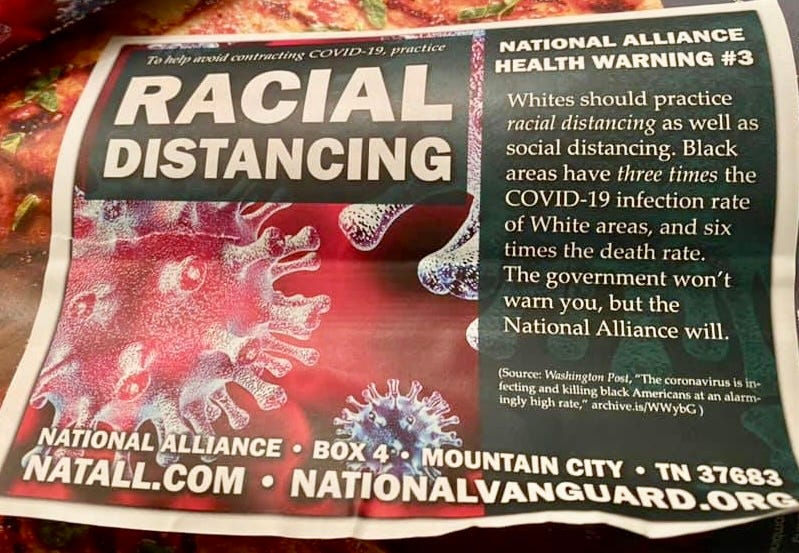
National Alliance
Don’t know if they’re related to the American Vanguard. I was taught in ad school that using current news, if possible and appropriate, can be a good creative linchpin. So you just get yourself a cheap piece of COVID stock art and tie the biggest news story of this Millenium to your movement. “National Alliance Health Warning #3” confuses me (I couldn’t find #1 or #2). Grade-B-.
American Renaissance
L—Now we’re pushing buttons. Again, Soviet-style artwork. This copy is the most direct call for a war I found Grade-B-. R—The headline kind of contradicts the left poster. That’s George Washington, I believe(?). Grade-C-.
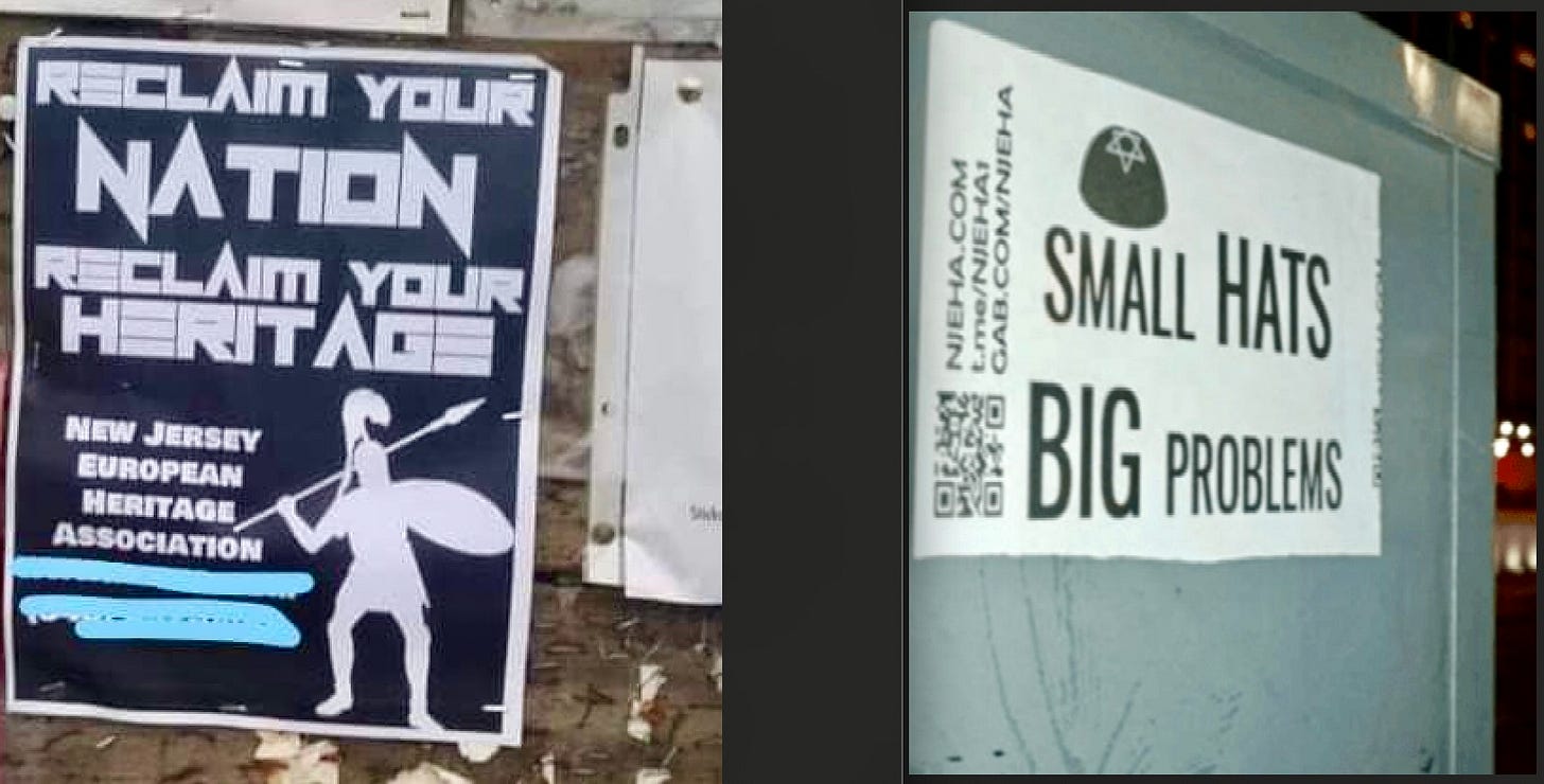
New Jersey European Heritage Association
L—Terrible type, bad art (a Roman soldier, I guess). Grade-D. R—Oh shit, they went there. This is the only “creative ad” style poster I found. Grade-B.
NOTE: Photographers—if you own any of these images and would like me to credit you and link to your website, or if you want the photo removed (it’s no problem, I found several copies of each flyer) email me: copyranter@gmail





to be honest, no easy way to distinguish the false flags and the trolls from the real deal.
You need a silkwood shower after touching all that stuff.