I wrote about the power of the unexpected visual six years ago for Digiday (subscription). And now we’re back again because the industry apparently hasn’t learned a fucking thing since then. (Also, not many creatives read Digiday, a digital marketing site).
Thanks in very large part to social media, very few creatives think visually anymore (NOTE: emojis and memes are not visuals), which is a damn shame. Because it is still inarguably the best way to create a great ad. And by “ad” I mean anything: Twitter/Facebook/Instagram/TikTok/whatever-the-fuck posts, TV, YouTube, pre-rolls, videos, billboards, beer coasters, etc. And copywriters? Guess what—you’re not “writers”, you’re ideators. (Not a word, I know. The Free Dictionary describes an ideator as: “A person experiencing suicidal ideation”.)
Creatives are now under tighter deadlines to turn around (shitty) work and thinking visually is harder than writing a “punny” line. Boo. Fucking. Hoo.
This is how it works: people buy a product because it benefits them, not because of “engagement numbers”. You made a meme with the product that then got shared thousands of times? Who gives a shit. It’s forgotten almost instantly.
What’s not forgotten almost instantly? Dramatically, and yes unexpectedly, showing a benefit. This is the best way to sell a product; always has been, always will be.
To the Whiteboard (kidding, Whiteboards are for marketing dipshits). None of these ads are from this year, or the last five years, because advertising has seriously lost its way (more on that development in the near future).
1. Burger King
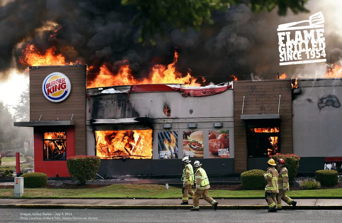
We’ll start with one that everybody knows, maybe the last truly bold campaign. “Flame-Grilled” has been BK’s USP for decades. For those of you not in the industry, what ad agency DAVID Miami did was find photos of real Burger King restaurants that had really burned down.
Unexpected Visual ads usually need minimal copy, if any. You see the ad, you get the message in one second. You’re sold on the USP in two seconds.
2. Klarna
Think you can’t do simple unexpected visuals in a TV/video ad? You’re a fish-brain. In 2016, the Swedish fintech launched a campaign off of a one word brief (there were many more words because marketers always be marketing, but it should have been): SMOOTH. Smooth payments. Smooth shopping. Etc.
Ad agency DDB Stockholm (Direction: the Perlorian Brothers) added an extra “o” for emphasis: SMOOOTH. The “Swim”—Mermaid Dog spot went “viral”, but I prefer this mesmerizing “Fish” execution. Note the relaxing music and lack of annoying copy until the to-the-point payoff line. I wish I had made this ad. Don’t you?
3. Whiskas
TAG: Feeding your cat’s instincts.
Achingly simple yet perfectly unexpected. Ad agency: AMVBBDO, London. See the full campaign here.
4. Hot Wheels
Hot Wheels. Elite Collection. The stupid “MAKE DADDY JEALOUS” line is not needed. There are two more ads in the campaign, but this is a classic example of a “one ad wonder”. But what a wonderful ad it is. No car shots, but shit do I now miss the crap out of my Hot Wheels collection. (I have 4 or 5 stored somewhere, but they’re beat to shit.) Ad agency: O&M, Paris.
5. Head & Shoulders
Lastly, I LOVE this visual! No copy ad from 2009 by Saatchi & Saatchi, Guangzhou, China. Funny. Unexpected. And effective. Any questions? Good. Go do better visually-unexpected ads. The industry desperately needs them.
To see more great unexpected visuals, read:
The Lost Art Of Art Direction and The Lost Art Of Art Direction (continued).


You're funny. And right.
Yeet!