


Less Is More. One of the first things you learn at ad school. And other artsy vocation schools. When writing ads, use the fewest words possible. Or even, no words (several previous great examples here). How no words? Think visually. Think how to visually show the product benefit.
Using the fewest words possible doesn’t just apply to layouts. TV, too. Like this classic spot for Delizio coffee. Product benefit: duh, delicious. How to “say” that. Don’t say a fucking word. Ad agency: Ruf Lanz, Zürich, Switzerland.
Six more excellent examples below. Buy a subscription here.
1. LUCOZADE
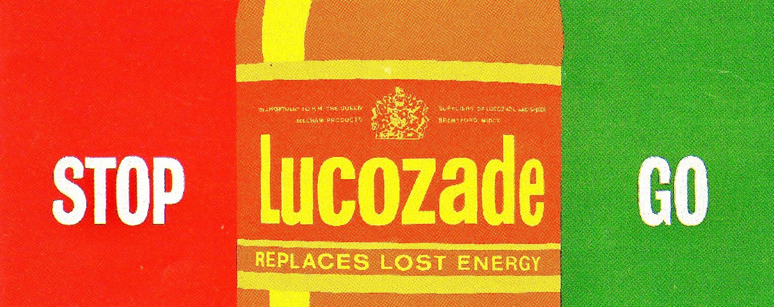
Quicker/Better than any Gatorade line. Ad agency: O&M.
2. SNICKERS (USA)

I, generally, don’t approve of the asinine made-up words of advertising. But this Snickers billboard works because the brand had established their “you’re not you when you’re hungry” campaign. Ad agency: TBWA NYC. CW: Gerry Graf.
3. HEINZ (UK)
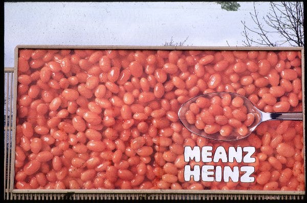
The HEINZ MEANZ BEANZ line—and vice versa—is maybe the most well known ad line in the UK. This is how you make an appetizing billboard out of it. Ad agency: Y&R.
4. THE HISTORY CHANNEL (USA)
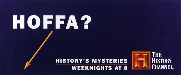
And BAM. You’re watching. Ad agency: kbs+p, NYC.
5. VW (USA)
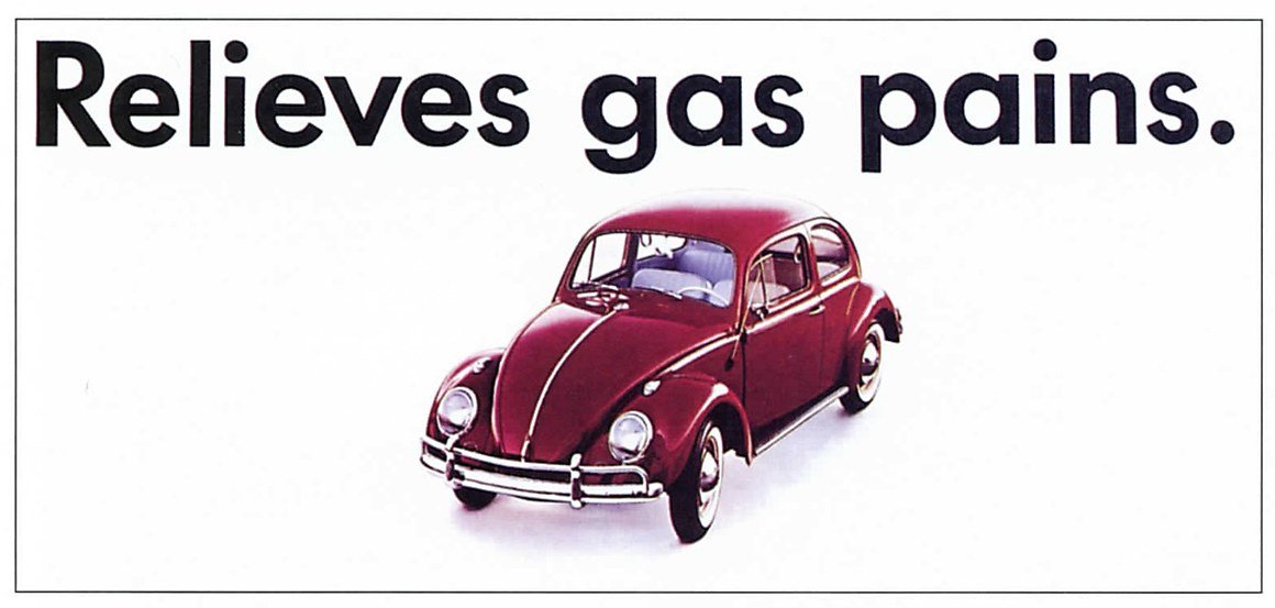
Other cars brands have since “borrowed” this line. This was the original. DDB. Art director: Si Lam. Copywriter: Bernie Rowe.
6. THE INDEPENDENT (UK)
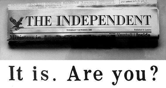
The “white-out-of-red” Economist ads get much deserved praise. But I prefer this stark, blunt force headline over the clever wordplays. Four words are you’re emotionally sold. Ad agency: Saatchi & Saatchi. CW: Tim Mellors.
Thanks again to Dave Dye. See more of less is more here.