A Collection Of Some Of The Dumbest Ads Ever Produced
13 ads culled from, not a shit-pile, but a shit-mountain.
“Dumb” is different from “Bad”. When I see a bad ad I say “Jesus that’s fucking terrible”. When I see a dumb ad I say “Jesus that’s fucking stupid”.
I’ve seen so many of both in the last 20 years, you seriously have no idea. This collection of course doesn’t include local/amateur ads. All of these ads were created by “professional” “creative” ad agencies.
No particular order.
Samsonite (South Korea)
“Cosmolite, the strongest and lightest Samsonite ever.” Of all the ways you could show luggage as STRONG and LIGHT, Photoshopping it into the hands of hockey players is maybe the stupidest visualization possible. It doesn't make an ice shard of fucking sense. Ad agency: Comma Communications Creative Boutique, Seoul, South Korea.
Gossip News Magazine (Uruguay)
THE OTHER SIDE OF NEWS. Yes, that’s Lindsay Lohan’s head right side up with her body (and hair) upside down. Or, vice versa? And, uh, her face has two chins? You figure this stupid shit out. Ad agency: Soul Fast.
Burger King (Germany)
Headline translation: LISTEN TO YOUR GUT FEELING. See, it’s a huge undigested double burger forming a six-pack. Are those sesame seeds in his belly button? This was a real ad that ran in a real publication, King Magazine, that BK handed out at their restaurants. Ad agency: Interone, Munich.
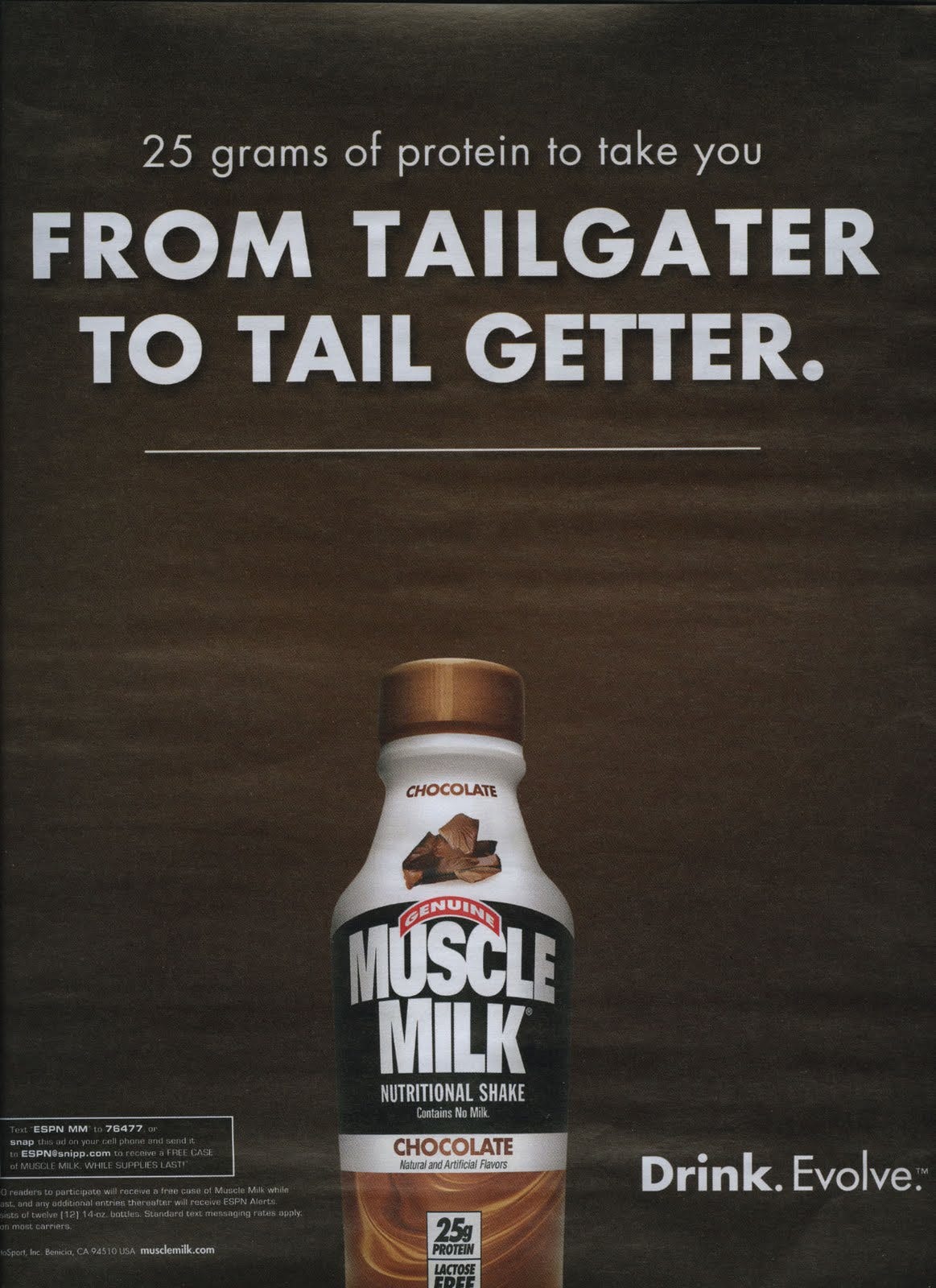
Muscle Milk (USA)
Ad scanned from ESPN magazine. Muscle Milk (which contains no milk, WTF FDA) targets sports bros with the waft of pussy. Well, ass. Want to “score” fellas? Just drink this drink—in between beers—that contains as much sugar as protein. BOOM—instant muscles, instant pre-game sex. Evolve™. Ad agency: unknown.
Mitchum (USA)
According to this campaign, the “MITCHUM MAN” is a slobby stupid future revenge porn felon. Double headline, right:
“IF YOU CONVINCED HER THE PHOTOS ARE FOR YOUR PRIVATE COLLECTION YOU’RE A MITCHUM MAN.” “IF YOU DELETED THE UNFLATTERING ONES YOU’RE A SENSITIVE MITCHUM MAN.”
Ad agency: unknown.
Nordea Bank (Latvia)
The spot is titled “THE FEELING”. Rough translation: “This is the feeling when retirement is a safe place.” This is an example of the dumbest of dumb borrowed interest ideas. ‘Hey, the dance scene from “Pulp Fiction” is cool, let’s recreate that—it will make us, a 500 hundred billion dollar bank, look cool also’. This generic ad could be for ANY PRODUCT OR SERVICE trying to make you feel “good”. Ad agency: DDB Latvia.
Saída De Emergência (Portugal)
Some painfully bad and ugly Photoshop. Ad is for a bookseller in Lisbon. “Read and Grow”. See, this is your brain being literally “irrigated”. Such an unappealing image, such a stupid idea. Ad agency: Fuel, Lisbon.
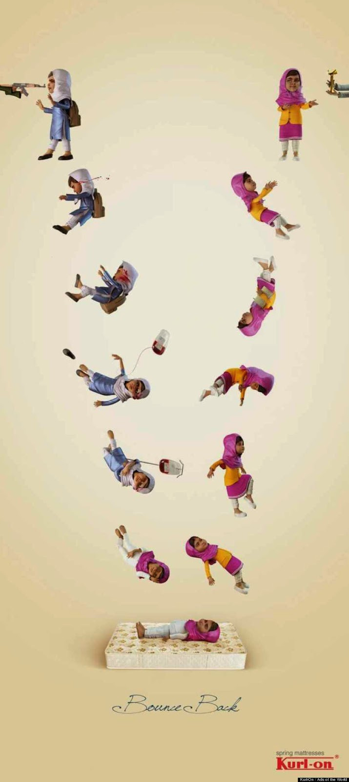
Kurl-On Mattresses (India)
India hates Pakistan, and vice versa. Here, an Indian mattress company decided to use Malala Yousafzai—the Pakistani girl shot in the face by the Taliban—to sell their springy product. Note the blood. “Bounce Back”. LOL, good one! Ad agency: O&M India.
eBay (USA)
Back in 2011, eBay released this instantly universally despised spot (selling tablets) that viciously mocked a man daring to use a pen to take notes in a business meeting. The dislikes piled up so quickly, eBay set it to private, then deleted it. Ad agency: Venables Bell & Partners, San Francisco.
Jacobs Instant Coffee (Israel)
“If there’s no Jacobs it’s not worth sticking around”.
Here you see an Israeli man leaving his wife because there's no Jacobs (a Kraft brand) instant coffee in the house. I don’t think that’s the real reason. Note the fake tear.
It was the opening he was waiting for; for once, she forgot to buy the Jacobs. "Tell mommy I still love her, and that I'll be at the Tel Aviv Sheraton drinking Jacobs, waiting for break-up booty calls.”
Ad agency: JWT, Tel Aviv.
Pert Plus (USA)
When this amazingly stupidly sexist ad came out in 2011, I thought it had to be a parody. It was not. Why is neighbor man in the “doghouse”? Well, this is what he did for his wife’s birthday:
“She wanted something that would go from zero to 200 in three seconds so I got her a scale.”
Ad agency: Sigma Group, New Jersey.
WonderBra (Greece)
There’s no way you can understand this idiotic ad without reading the agency press note:
"It is a proven fact that a Wonderbra bra is to males as a magnet is to iron. So, the print ad “Magnet” focuses on the Wonderbra logo’s special magnetic field. When taking a closer look, the reader understands that the iron fillings are actually male names. No two names are alike in this extraordinary magnetic field, and in all, more than 3.500 names have been used."
That is truly one of the dumbest things I’ve ever read. Ad agency: XL, Athens, Greece.
World Water Day (Belgium)
To read this World Water Day mailing, you had to run it under water—YOU HAD TO WASTE WATER. Christ. Translated line: "Without water, knowledge cannot flow”. Also, without water, we all fucking die. Ad agency: Duval Guillaume, Antwerp.


Slow news day out there? The article fits the ads, which says nothing good about either.
fuck you