The Power Of Words: The Lost Art Of Copywriting.
Are there ANY good copywriters left out there? Hello? Asking for David Abbott, Neil French, Ed McCabe, Mary Wells Lawrence, Diane Rothschild, Tom McElligott, etc.
A couple times a month, I have to go back into the archives and create a post that makes me feel good about advertising, that gives me a bit of hope for the future of this barely-creatively-alive industry.
The feeling never lasts, because tomorrow I will scroll through a shit-ton of new shitty-ass ads each one shittier than the previous/next one.
I previously posted about the Lost Art Of Art Direction. It’s your turn, CWs.
BARSKA Binoculars
STORYTELLING. A word that’s been heavily bandied about by marketing types for about the last 10 years, with most of them not having a fucking clue what the word actually means, vis-á-vis advertising.
To discover what it means, read the above 2008 newspaper ad for BARSKA premium binoculars. READ it. It’s the story of “Ernest”. He’s a stalker, but he prefers to think of himself “as a stranger enthusiast”. He sent Lucy a present: ”I don’t think anyone’s every given her a live scorpion before”.
Yes, it’s a real ad. See the other executions—”George” and “Sharon”—here. The ads are obviously tongue-in-cheek. But this campaign would have zero chance of approval in 2022. That’s too bad, because the copywriter(s) at South African ad agency Ireland|Davenport crafted a conceptional winner. The product benefits are woven in “seamlessly”, and the story is tied off with a perfect tagline: Putting The King Back In Stalking.
Jim Beam
Great copywriting is of course also about great headlines. Headlines that tell a story, that put a distinct image in your head. I drink bourbon. I’ve never drank a vodka cranberry, and I never will. Ad agency: Energy BBDO, Chicago. See the rest of the campaign here.
Harley-Davidson
COPY:
Give us life at ground level, rolling along the endless highway on a Harley-Davidson. 100% depressurized. Just sunlight on chrome. The voice of a V-Twin ripping the open air. And elbow room, stretching all the way to the horizon. Maybe you think this is the way life ought to lived. Time to spread some wings.
The ad was written by Jim Nelson while at Carmichael Lynch. But he doesn’t take credit for it. He credits the high-energy creative environment of the agency (read his great take here). I know what that environment feels like. Good fucking luck finding it in any agency today.
Bayer Cafiaspirina
Campaign from 2012 for Bayer’s Cafiaspirinia, aspirin with caffeine (which increases the analgesic effect, apparently). It’s clever, it’s funny, and most importantly, it’s effective. And it’s another great example of copy creating visuals in your mind. Ad agency: BBDO, Brazil.
ecotricity
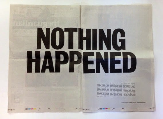
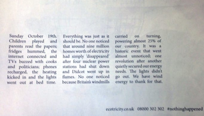
The above double-page ad ran in the November 7th issue of the Guardian. It’s another great example of Storytelling. It’s also a perfect example of a “disruptive” (another buzzword that marketing people overuse and don’t understand) ad.
How many people do you think who read that headline didn’t read the copy? Probably very few. Now read the copy. Actually something very BIG happened, thanks to ecotricity, Britain's leading green energy supplier.
This is a copywriting masterclass. Ad agency: Man+Hatchet, London.
Moulinex Blenders
How bout a copywriter who brilliantly made a headline the visual? They just threw it into a Moulinex blender. Here’s two more similar ads in the campaign. Ad agency: BBR Saatchi & Saatchi, Tel Aviv, Israel.
Newcastle
Lastly, the best example ever of a copywriter brand-jacking. Newcastle took a very satisfying piss into a “chalice” of Stella Artois. Erected right here in NYC. No Bollocks, indeed. Ad agency: Droga5, NYC.
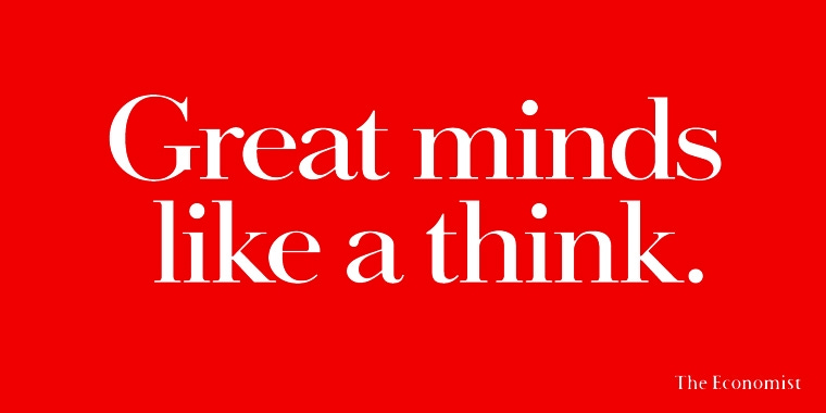
POST NOTE: Of course any discussion of all-copy ads should start with The Economist “White Out Of Red” campaign by Abbott Mead Vickers (Yes, that Abbott). I purposely left it out because it deserves its own article. See a few more executions here.


I love the Barska ads. It's sad that in the US one needs to say "The ads are obviously tongue-in-cheek." Imagine someone taking them seriously... Looks like they have a sense of humor in South Africa. Remember the award winning Energizer print ads that also came out of South Africa? Tagline: Never let their toys die.
The Harley ad is great, but dollars to doughnuts the inspiration was the original great "Somewhere..." copy written for the 1923 Jordan Playboy ad that ran in the Saturday Evening Post. I have an original ad framed in my office to remind me that some 100-year-old copy just doesn't get stale: https://i2.wp.com/www.curbsideclassic.com/wp-content/uploads/2017/02/Jordan-somewhere-west-of-laramie-jordan.jpg