There are of course thousands and thousands of “bad” ads produced every year that are bad simply because they’re stultifyingly boring and not worth a word of comment.
These bad boys, though, aren’t just boring. They all have a little extra something—god-awful writing, blatant sexism, devastatingly unfunny “jokes”—that set them apart from the annual shit-mountain of crappy advertising.
Ten ads, in no particular order, except for number 10, which is The Worst Ad Of 2022. Six of the ads are American, whereas none of the Best Ads of 2022 are via the USofA.
1. Volvo (USA)
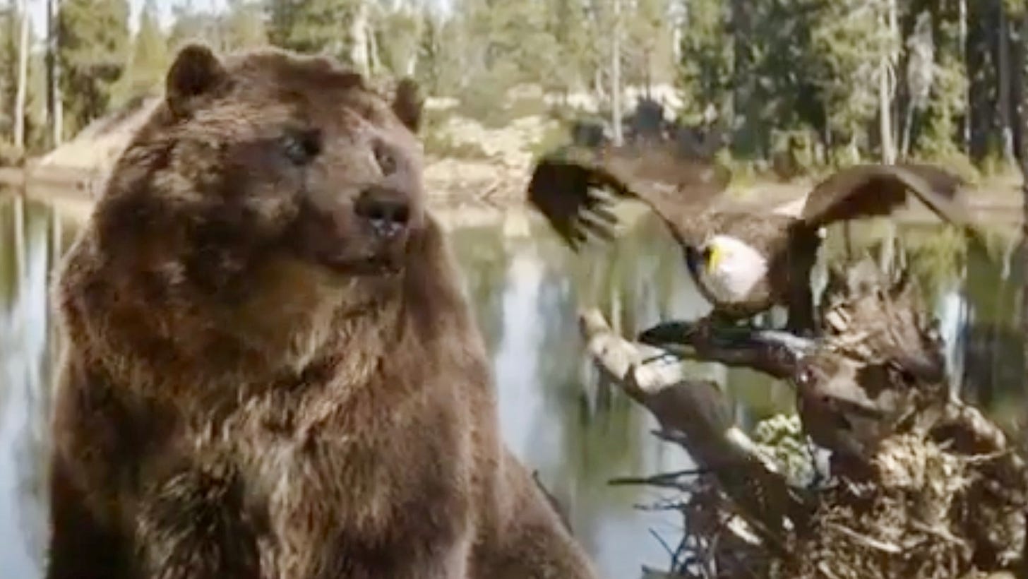
This ad for the 2023 Sorento Turbo-Hybrid is titled “The Bear And The Eagle”, because at the end of the ad, there is a bear and there is a (bald) eagle. The eagle has caught a fish and drops it, flapping, at the adventurous fisherman’s feet. No clue why the bear is there.
But it’s the ad’s laughably inanely plain-wrong kicker copy line that landed it on this list:
“THE WORLD’S FIRST STORYTELLING MACHINE”
Say WHAT? Brands of course love saying “world’s first” or “world’s most”. Often they’re specious claims. This one is 100% bullshit and 110% illogical.
First, the illogical. If KIA had called it “the world’s first story-finding machine”, that would have made some sense. But they didn’t.
Does the car tell you stories as you drive? No. Does it recount your journey to you in story form after you’re done? No. Does it in fact have any storytelling abilities/technology what-so-fucking-ever? NO.
Now, the bullshit. A partial list of storytelling machines invented well before this car (which we’ve firmly established is NOT such a machine): telegraph; radio; record player; movie projector; TV; the See ‘N Say; computers. Ad agency: none.
2. Volkswagen Taos (USA)
The worst car ad of the year, edging out the above Volvo bullshit. “I Like Birds”, like ALL Eels songs, is not a happy song. (Does he look like an optimistic man?) It’s about how much this horrible fucking world (including CARS, VW) is fucking horrible. So, focus on about the only good thing: Birds. First two verses below:
I can't look at the rocket launch
The trophy wives of the astronauts
And I won't listen to their words
'Cause I like…BirdsI don't care for walkin' down town
CRAZY AUTO CAR GONNA MOW ME DOWN (emphasis mine)
Look at all the people like cows in a herd
Well I like…Birds
What does the “Taos” have in common with birds? NOTHING. VW clunkily edits out the above bolded line. Who do they think they’re fooling? I guess Gen Zers. DON’T BE FOOLED, youngins’. Ad agency: Johannes FUCKING Leonardo.
3. TSB Bank (UK)
What up, David Schwimmer! America misses your lame ass. Good to know you’re finding work overseas. From the ad agency press note:
“(Schwimmer) gives the brand personality and warmth; celebrating everyday pleasures through a "real-world" lens. The film shows Schwimmer on a tenacious quest to show TSB customers that savings really can sneak up on them…”
“Real-world”? Schwimmer tenaciously “disguises” himself as a massage chair, a sunglasses rack, and a painting to sneak up on people to demonstrate that TSB Bank will give you “savings that sneak up on you”. That’s so goddamn funny! Brilliant concept, McCann London. TV ad from January.
4. KFC (Columbia)
UNKNOWINGLY, WE TAUGHT YOU HOW TO HOLD YOUR GREATEST LOVE.
Hold. And EAT? KFC Father’s Day ads via Colombia. How bout the fucking hubris of this campaign, comparing buckets of shitty chicken to babies? There is no tongue nor cheek here; they’re serious. And who holds a bucket of chicken after they get it home and uncovered? Nobody. OK, maybe folks with no heat. Ad agency: Mass Digital.
5. One World Trade Center
This “clever” online wordplay ad appeared late Summer. Twenty-one years later, yes it is STILL TOO FUCKING SOON, especially for us Gothamists—the target of this ad. Use “Autumn”, or put your lame brain to the grinder a bit longer and think of another “height” or “tall” or “one” wordplay line. Asshole.
6. TaxSlayer (USA)
SEE…IT’S A…“CASH…COW”.
This breaks the first “see-say” rule of advertising. Since it’s a Tax”Slayer” ad, we can assume that the asshat “cowboy” promptly killed the poor abused-by-lazy-first-year-ad-school-student-idea cow, probably with a hammer. Ad agency: the creative juggernaut Party Land of LA.
7. Stella Artois (The UK)
The over-priced beer introduced an “unfiltered” lager campaign in 2022. It “tells the story of a happy slow-paced (fake) European town where the inhabitants enjoy their beers naked”. Continues Meg Chadwick, senior brand manager at Stella Artois Europe:
“Our campaign ‘Beer, au naturel’ speaks to the truth of our naturally unfiltered beer – a lager in its most natural form.”
See, the people are “unfiltered” by clothing (INSIGHTFUL). Using naked people to sell “naturalness” has been done and overdone in our near-done industry since the naked “hippies” of the 60s. This campaign (here’s the TV spot, which offers no additional insights) is not at all hip or original or even slightly interesting. Ad agency: Mother, London.
8. Diehard (USA)
Diehards Choose DieHard.
Internal meeting:
CLIENT: “We need more name recall! We need an ad that DIES HARDER!”
AGENCY (Y&R) Account Douche: “How bout something that doesn’t make a lick of sense.?”
CLIENT: “SOLD!” Wait, what’s the idea?
AGENCY: “OK, keeping with the ‘senseless’ theme, we’ll eschew cars and hook a DieHard up to the gloves of a boxer getting the shit beat out of him.”
CLIENT: “I love boxing! But, uh, wouldn’t that electrocute him?”
AGENCY: “Maybe!”
9. Layer’r’s Shot (India)
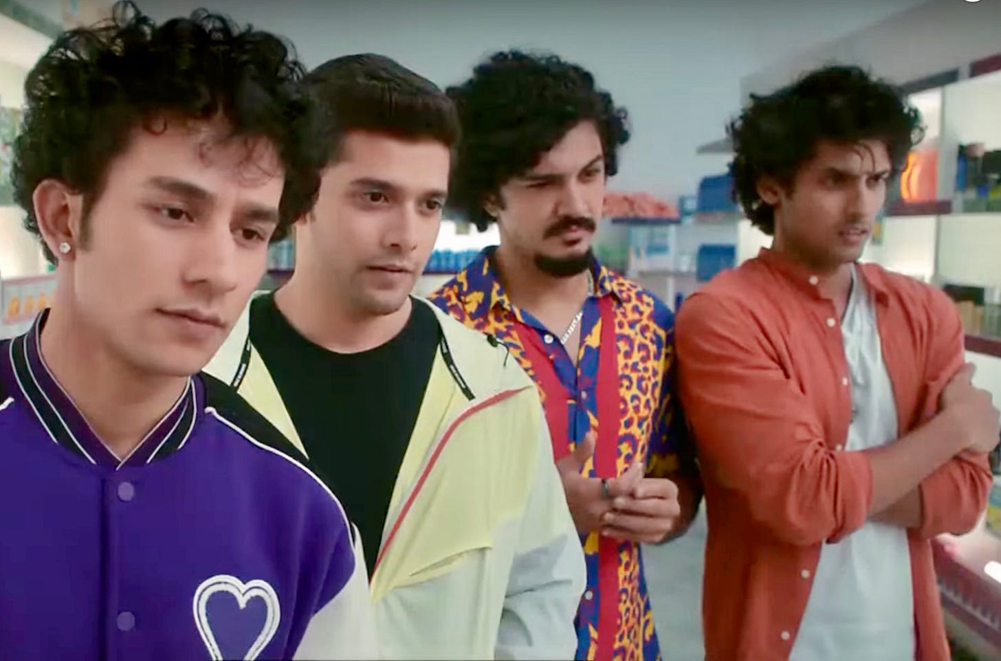
India wins the most sexist ad of the year award pretty much every year (South America gives them some competition). Here, we see four lads eyeing up BABE, deciding which one of them (or maybe all of them) will be inserting their penis in her. COPY:
“We’re four, and there’s only one. So, who will take the shot? It calls for a shot.”
See, they’re not talking about the woman, there’re talking about the one bottle of Shot fragrance left on the shelf. Slick gang-rape double entendre. The Indian government quickly pulled the ad, writing:
(“the ad was) detrimental to the portrayal of women in the interest of decency and morality"
NO SHIT.
10. Shake Shack (USA)
This :15 spot is my personal bottom worst ad of 2022, because of this one line of copy:
“Man, if we had to explain Buffalo Wings to Aliens, they’d probably kill all of us.”
BWA-HA-HA, you’re RIGHT they WOULD, man! Wait. Why would they? Eh, because they’re not from Buffalo, the animal, but Buffalo, the city? Yeah, SHIT, that would piss them off. Right up there with polluting our planet to death and mass murdering thousands of school kids and all the instances of mass genocide through Earth’s history…Yeah, Buffalo Wings gotta be high on their Reasons To Obliterate Us list.
Ad agency: Majority (Shaquille O’Neal is a founding partner), who say this on their website:
“Majority is a first-of-Its-kind creative agency that combines a multicultural talent model with award-winning general market capabilities. Mission-built to open new doors of opportunity – on the belief that diversity is the ultimate competitive advantage for ideas that land in culture.”
Well, this “idea” “landed”, right at the bottom of 2022.


