


Foreboding pre-9/11 Ads Featuring The Twin Towers.
Six ads.

It’s free article Monday. Buy a reduced rate annual subscription here. Tomorrow, the price goes back up.
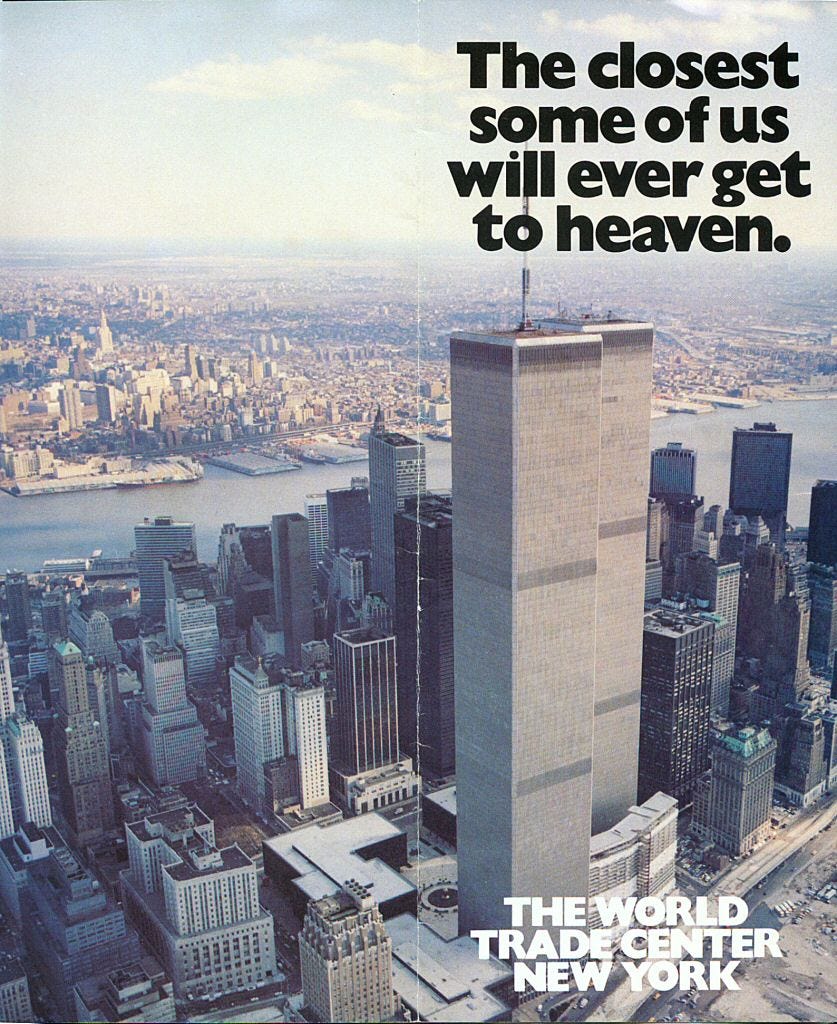
Some closer than others. This is the cover of a brochure for the WTC. I dined at Windows On The World a couple of times, been on the roof a couple of times. The views were amazing.
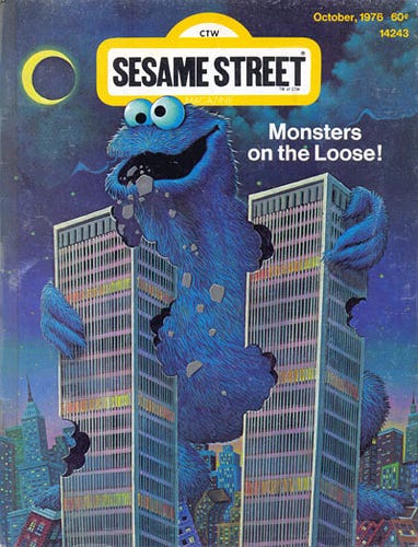
Cookie occasionally needed some ruffage in his diet.
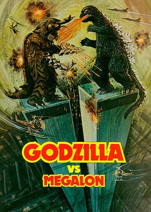
If only they had been there, they could have paused their fight and swatted away the planes, or something.
Yikes.
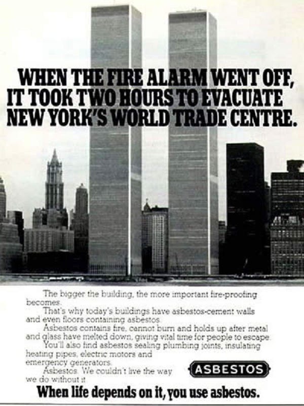
Yeah, not so much, asbestos.
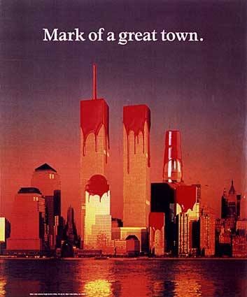
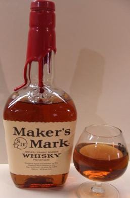
This must be a post-9/11 fake image, one would think. No, it was part of a 1990 American city campaign for Maker’s Mark bourbon, who seal their bottles with red wax. Christ, that’s creepy.
World Trade Center Pre 9/11 In Spider-Man 2002
https://spiderman.fandom.com/f/p/4400000000000000779
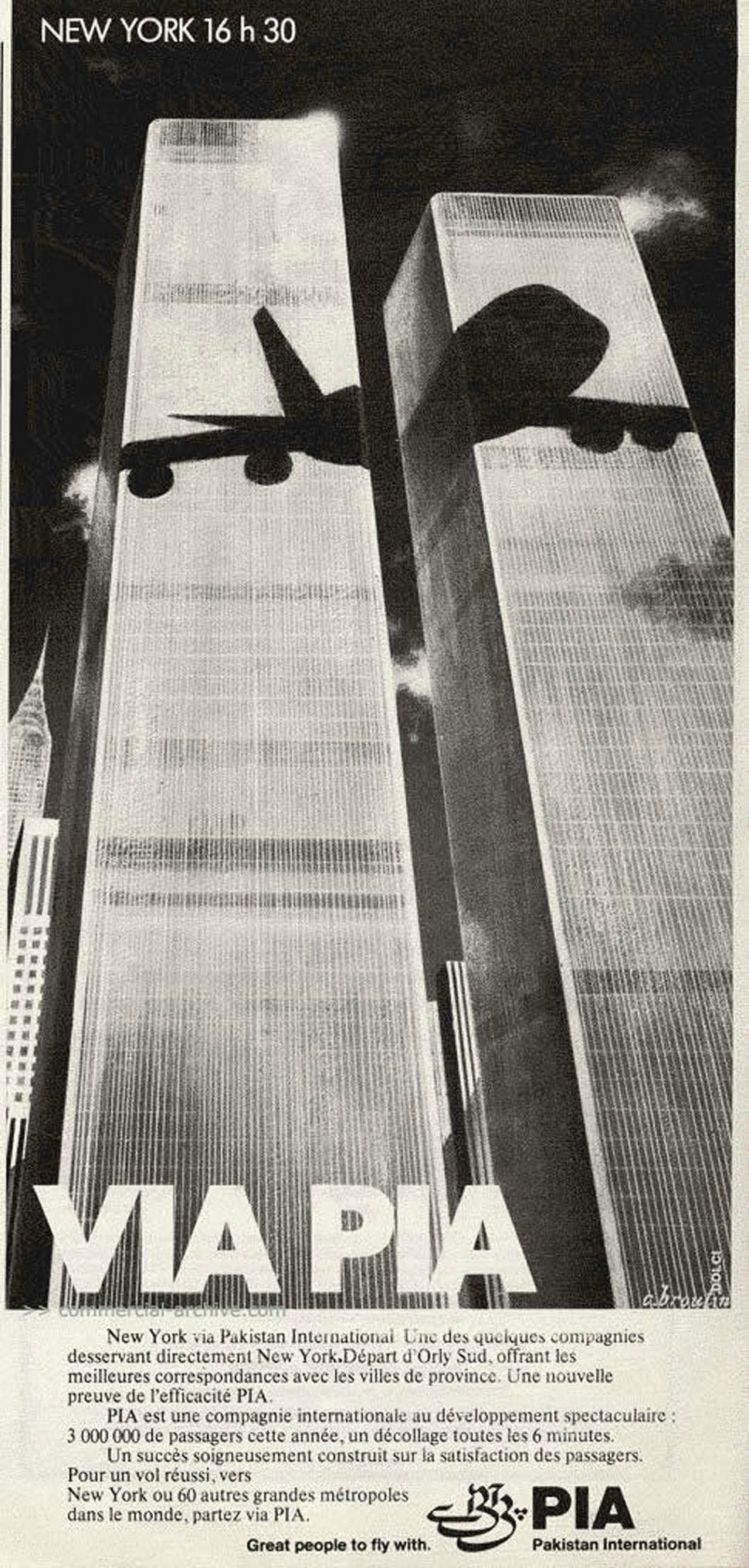
JFC! The PIA is the most disturbing one! Good ol' Nostradamus musta been nodding approvingly, from wherever he is. However, those buildings sure carried a load of significance, for what they represented, long before 2001. Maybe too obvious a symbol and a target. Nevertheless, too many creepos in this business.