


A Strictly Creative Review Of Palantir's "Dominate" Logo.
A not-very-deep dive.

I’m not here to talk about them currently making a database of every fucking detail of every fucking American.
Just the terrible logo and tagline.
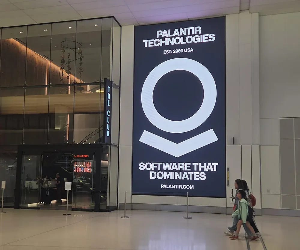
SOFTWARE THAT DOMINATES. Fuck YEAH. That sound is the simultaneous unzipping of thousands of Silicon Valley males’ pants as they stroke one out before coffee. Maybe into their coffee, bunch of overcompensating weirdos.
What does it “dominate”? Other software? The Internet? Women (A top exec isn’t fond of females.)? The World? You? Me? Us?
OK, to the logo. Rather…unsubtle, uncreative. Why not just make that bottom arrow-ish part more dominate, like the male symbol, below left. It’s kinda, a combo of the two?

It also, kinda, looks like a screaming person with a big mouth with their arms reaching out.

Or: The “O” could be something. The world. A brain. Or, stand for: Optimize; Operation; One as in, the ONE? A “circle” can represent: Infinity; Unity; female energy (Yeah-nah).
It’s just Cold and Ugly. Which, is how the future is looking, more and more, every day. So perfect for Palantir, I guess.